数据看板可视化
前言
这段时间一直在做可视化,在我的项目中有一部分是电力巡检的数据可视化。其中的数据看板比较简单,我将其单独抽离出来形成一个demo,为保密demo中数据非真实数据。先看效果。
具体效果

链接相关
- 浏览链接:http://xisite.top/original/data-board/index.html#/
- 项目链接(觉得有用的记得star哦):https://gitee.com/xi1213/data-board
实现目标
- 可根据项目切换不同看板数据。
- 数据的展现形式包括:折线图,柱状图、饼图、环图、进度图、轮播图。
- 包含一个可控制的3d球体,球面打点具体数据。
具体实现
数据切换
没啥技术含量,demo数据我是写死,要使用的可以直接拿去替换为自己的接口数据。
 projectPtions: [

                {

                    value: '1',

                    label: '四川项目',

                    sphereData: [

                        {

                            position: [102, 30],

                            pointName: "成都",

                            value: 31889355

                        },

                        {

                            position: [102, 27],//经度,纬度

                            pointName: "西昌",

                            value: 13578453

                        },

                        {

                            position: [107, 31],//经度,纬度

                            pointName: "达州",

                            value: 7854541453

                        },

                    ],

                    msg: {

                        distance: 12245,//巡检距离

                        towerNum: 85345,//杆塔数量

                        defectNum: 208//缺陷数量

                    },

                    lineData: [

                        [140, 232, 101, 264, 90, 340, 250],

                        [120, 282, 111, 234, 220, 340, 310],

                        [320, 132, 201, 334, 190, 130, 220]

                    ],//折线图数据

                    pieData: [234, 124, 156, 178],//饼图数据

                    ringData: [100, 120, 104, 140, 160],//环图数据

                    histData: {

                        xAxisData: ['成都', '南充', '宜宾', '西昌', '眉山', '乐山', '攀枝花'],

                        seriesData: [635, 880, 1165, 135, 342, 342, 524]

                    },//柱状图数据

                    proData: [29, 67, 90],//进度图数据

                },

                {

                    value: '2',

                    label: '西藏项目',

                    sphereData: [

                        {

                            position: [91.11, 29.97],//经度,纬度

                            pointName: "拉萨",

                            value: 78453

                        },

                        {

                            position: [80, 32],//经度,纬度

                            pointName: "阿里",

                            value: 13578453

                        },

                        {

                            position: [88, 29],//经度,纬度

                            pointName: "日喀则",

                            value: 7854541453

                        },

                    ],

                    msg: {

                        distance: 20018,//巡检距离

                        towerNum: 87624,//杆塔数量

                        defectNum: 126189//缺陷数量

                    },

                    lineData: [

                        [14, 22, 100, 164, 200, 140, 250],

                        [120, 22, 111, 24, 220, 240, 310],

                        [10, 132, 201, 334, 190, 30, 220]

                    ],//折线图数据

                    pieData: [134, 154, 156, 198],//饼图数据

                    ringData: [120, 180, 114, 120, 110],//环图数据

                    histData: {

                        xAxisData: ['拉萨', '日喀则', '昌都', '林芝', '山南', '那曲', '阿里'],

                        seriesData: [100, 280, 467, 956, 345, 111, 61]

                    },//柱状图数据

                    proData: [69, 37, 50],//进度图数据

                },

                {

                    value: '3',

                    label: '浙江项目',

                    sphereData: [

                        {

                            position: [119, 27],//经度,纬度

                            pointName: "温州",

                            value: 78453

                        },

                        {

                            position: [120, 29],//经度,纬度

                            pointName: "宁波",

                            value: 13578453

                        },

                        {

                            position: [120, 30],//经度,纬度

                            pointName: "嘉兴",

                            value: 7854541453

                        },

                    ],

                    msg: {

                        distance: 18722,//巡检距离

                        towerNum: 122334,//杆塔数量

                        defectNum: 127895//缺陷数量

                    },

                    lineData: [

                        [104, 122, 200, 164, 20, 140, 250],

                        [220, 22, 111, 24, 120, 40, 10],

                        [130, 32, 201, 34, 190, 30, 200]

                    ],//折线图数据

                    pieData: [134, 174, 156, 108],//饼图数据

                    ringData: [190, 110, 174, 130, 110],//环图数据

                    histData: {

                        xAxisData: ['杭州', '宁波', '温州', '嘉兴', '湖州', '金华', '舟山'],

                        seriesData: [1035, 100, 565, 435, 142, 842, 124]

                    },//柱状图数据

                    proData: [89, 37, 60],//进度图数据

                },

            ],
数组中的每一个对象代表一个项目。
切换项目时直接使用element的el-select切换即可。由于图表组件是区分了组件的,每次切换数据时需要根据不同数据重绘图表。
折线图
图中可以看到一共只有九个图表。比较简单,直接使用echarts配置即可。这是折线图。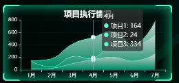
可能会感觉奇怪,折线图咋会这样呢?那是因为在配置中设置了areaStyle与smooth,使折线图变成了平滑的堆叠面积图,本质还是折线图。areaStyle中的color可以接受echarts.graphic.LinearGradient,使其具有渐变的颜色,LinearGradient的前四个参数分别为渐变色的起始点与终止点的x值与y值,后面的值为颜色值。
 let option = {

                color: [],

                title: {

                    text: '项目执行情况',

                    top: "5%",

                    left: 'center',

                    textStyle: {

                        color: "#fff"

                    }

                },

                tooltip: {

                    trigger: 'axis',

                    axisPointer: {

                        label: {

                            backgroundColor: '#6a7985'

                        }

                    }

                },

                grid: {

                    top: "20%",

                    left: '3%',

                    right: '4%',

                    bottom: '3%',

                    containLabel: true

                },

                xAxis: [

                    {

                        type: 'category',

                        data: [],

                        axisLabel: {

                            color: "#fff",

                        },

                        axisLine: {

                            lineStyle: {

                                color: this.dataVColor[1]

                            }

                        }

                    }

                ],

                yAxis: [

                    {

                        type: 'value',

                        axisLabel: {

                            color: "#fff",

                        },

                        axisLine: {

                            lineStyle: {

                                color: this.dataVColor[1]

                            }

                        },

                        splitLine: {

                            show: true,//网格设置

                            lineStyle: {

                                color: "#70707033",

                                width: 1,

                                type: "dotted",//虚线

                            },

                        },

                    }

                ],

                series: []

            };

            option.xAxis[0].data = chartData.xAxisData;

            chartData.seriesData.forEach(s => {

                option.color.unshift(this.dataVColor[1]);//注意颜色添加的顺序

                option.series.push(

                    {

                        animationDuration: 3000,//动画时间

                        animationEasing: "cubicInOut",//动画类型

                        name: s.name,

                        type: 'line',

                        smooth: true,

                        stack: 'Total',

                        lineStyle: {

                            width: 1

                        },

                        showSymbol: false,

                        areaStyle: {

                            opacity: 0.8,

                            //使用线性渐变颜色(x1,y1,x2,y2,渐变数组)

                            color: new echarts.graphic.LinearGradient(1, 1, 1, 0, [

                                {

                                    offset: 0,

                                    color: this.dataVColor[0]

                                },

                                {

                                    offset: 1,

                                    color: "#fff"

                                }

                            ])

                        },

                        emphasis: {

                            focus: 'series'

                        },

                        data: s.data

                    }

                )

            });

            await (option && this.lineChart.setOption(option));//设置数据
饼图

饼图我一样在itemStyle的color中设置了渐变色。饼图的尺寸是通过series中的radius来控制的,位置是center来控制的。
 let option = {

                title: {

                    text: '任务类型占比',

                    top: "5%",

                    left: 'center',

                    textStyle: {

                        color: "#fff"

                    }

                },

                tooltip: {

                    trigger: 'item'

                },

                series: [

                    {

                        type: 'pie',

                        animationDuration: 3000,

                        radius:"60%",

                        animationEasing: "cubicInOut",

                        center: ["50%", "60%"],//饼图位置

                        label: {

                            color: "#fff"

                        },

                        emphasis: {

                            label: {

                                show: true,

                                fontSize: '20',

                                fontWeight: 'bold'

                            }

                        },

                        data: [],


                    }

                ]

            };

            chartData.seriesData.forEach(s => {

                option.series[0].data.push(

                    {

                        value: s.value,

                        name: s.name,

                        itemStyle: {

                            color: new echarts.graphic.LinearGradient(1, 1, 1, 0, [

                                {

                                    offset: 0,

                                    color: this.dataVColor[0]

                                },

                                {

                                    offset: 1,

                                    color: "#fff"

                                }

                            ])

                        }

                    }

                )

            });

            await (option && this.pieChart.setOption(option));//设置数据
环图
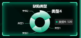
环图其实就是饼图的变形。将series中的radius设置为两个元素的数组即可,数值为内外环的半径比。
 let option = {

                title: {

                    text: '缺陷类型',

                    top: "5%",

                    left: 'center',

                    textStyle: {

                        color: "#fff"

                    }

                },

                tooltip: {

                    trigger: 'item'

                },

                series: [

                    {

                        type: 'pie',

                        animationDuration: 3000,

                        animationEasing: "cubicInOut",

                        radius: ['30%', '60%'],//内外环半径比

                        center: ["50%", "60%"],//饼图位置

                        label: {

                            color: "#fff"

                        },

                        emphasis: {

                            label: {

                                show: true,

                                fontSize: '20',

                                fontWeight: 'bold'

                            }

                        },

                        data: []

                    }

                ]

            };

            chartData.seriesData.forEach(s => {

                option.series[0].data.push(

                    {

                        value: s.value,

                        name: s.name,

                        itemStyle: {

                            color: new echarts.graphic.LinearGradient(1, 1, 1, 0, [

                                {

                                    offset: 0,

                                    color: this.dataVColor[0]

                                },

                                {

                                    offset: 1,

                                    color: "#fff"

                                }

                            ])

                        }

                    }

                )

            });

            await (option && this.ringChart.setOption(option));//设置数据
柱状图
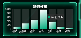
柱状图也一样设置了渐变色。每个柱子后面的阴影是通过series中的showBackground设置的。
 let option = {

                title: {

                    text: '缺陷分布',

                    top: "5%",

                    left: 'center',

                    textStyle: {

                        color: "#fff"

                    }

                },

                tooltip: {

                    trigger: 'item'

                },

                grid: {

                    left: '3%',

                    top: "20%",

                    right: '4%',

                    bottom: '3%',

                    containLabel: true

                },

                xAxis: {

                    type: 'category',

                    data: [],

                    axisLabel: {

                        color: "#fff",

                        interval: 0,

                        rotate: 20,

                    },

                },

                yAxis: {

                    type: 'value',

                    axisLabel: {

                        color: "#fff",

                    },

                    splitLine: {

                        show: true,//网格设置

                        lineStyle: {

                            color: "#70707033",

                            width: 1,

                            type: "dotted",//虚线

                        },

                    },

                },

                series: [

                    {

                        type: 'bar',

                        animationDuration: 3000,

                        animationEasing: "cubicInOut",

                        showBackground: true,

                        label: {

                            color: "#fff"

                        },

                        data: [],

                        color: new echarts.graphic.LinearGradient(0, 0, 1, 1, [

                            {

                                offset: 1,

                                color: this.dataVColor[0]

                            },

                            {

                                offset: 0,

                                color: "#ffffff"

                            }

                        ])

                    }

                ]

            };

            option.xAxis.data = chartData.xAxisData;

            chartData.seriesData.forEach(s => {

                option.series[0].data.push(s);

            });

            await (option && this.histogramChart.setOption(option));//设置数据
关系图

本来想用3d力导向图插件3d-force-graph的,但后面发现echarts自己也有类似的功能graph,直接设置series的layout即可,它有三种值:none(无任何布局),circular(环形布局)、force(力引导布局)。我用了circular,只有点,没有连线。
 let option = {

                title: {

                    text: '巡检工作待办',

                    top: "1%",

                    left: 'center',

                    textStyle: {

                        color: "#fff"

                    }

                },

                // tooltip: {

                //     trigger: 'item'

                // },

                series: [{

                    type: 'graph',

                    layout: 'circular',//环形布局

                    scaleLimit: {

                        min: .5,//缩放限制

                        max: 2

                    },

                    zoom: .7,

                    roam: false,

                    label: {

                        normal: {

                            color: "#fff",

                            show: true,

                            position: 'inside',

                            fontSize: 14,

                            fontStyle: '900',

                        }

                    },

                    data: []

                }]

            };

            chartData.seriesData.forEach(s => {

                option.series[0].data.push(

                    {

                        name: s.name,

                        value: s.value,

                        symbolSize: Math.round((s.value / maxSymbolSize) * 100),//尺寸

                        draggable: true,//允许拖拽

                        itemStyle: {

                            color: new echarts.graphic.LinearGradient(0, 0, 1, 1, [

                                {

                                    offset: 0,

                                    color: this.dataVColor[0]

                                },

                                {

                                    offset: 1,

                                    color: "#fff"

                                }

                            ])

                        }

                    }

                )

            });

            await (option && this.atlasChart.setOption(option));//设置数据
轮播图

这是直接用了element的走马灯组件,自己添加图片即可。
 <el-carousel :height="carouselHeight" indicator-position="outside" arrow="never" :autoplay="true"

                :interval="2000">

     <el-carousel-item v-for="item in defectImgList" :key="item.name">

         <img :src="item.img" fit="fill">

     </el-carousel-item>

 </el-carousel>
进度仪表图

这是具体配置:
 let option = {

                title: {

                    text: '\n{a|' + chartData.name + '}',

                    x: 'center',

                    y: '65%',

                    bottom: "0",

                    textStyle: {

                        color: "#ffffff",

                        rich: {

                            a: {

                                fontSize: 15,

                                fontWeight: 900

                            },

                        }

                    }

                },

                series: [

                    {

                        type: 'gauge',

                        radius: '86%',//仪表盘半径

                        center: ['50%', '45%'],//仪表盘位置

                        splitNumber: 5,

                        animationDuration: 3000,

                        animationEasing: "cubicInOut",

                        axisLine: {

                            lineStyle: {

                                width: 15,

                                color: [

                                    [1, new echarts.graphic.LinearGradient(1, 1, 0, 1, [

                                        {

                                            offset: 0,

                                            color: this.dataVColor[1]

                                        },

                                        {

                                            offset: 1,

                                            color: "#aaa"

                                        }

                                    ])]

                                ]

                            }

                        },

                        //指针

                        pointer: {

                            width: 3,

                            length: '70%',

                        },

                        //小刻度

                        axisTick: {

                            length: 5,

                            lineStyle: {

                                color: '#fff',

                                width: 1

                            }

                        },

                        //大刻度

                        splitLine: {

                            show: false,

                            length: 10,

                            lineStyle: {

                                color: '#fff',

                                width: 2

                            }

                        },

                        //刻度标签

                        axisLabel: {

                            color: '#fff',

                            distance: 5,

                            fontSize: 8,

                            fontWeight: 900,

                        },

                        detail: {

                            valueAnimation: false,

                            formatter: '{value}%',

                            color: '#fff',

                            fontSize: 15,

                            fontWeight: 900,

                            padding: [30, 0, 0, 0]

                        },

                        data: [

                            {

                                value: chartData.value

                            }

                        ]

                    }

                ]

            };

            await (option && this.progressChart.setOption(option));//设置数据
图表信息框动画
图表信息框自己显示轮播,其实是利用的echartsAutoTooltip.js这个东西,东西不大,这是他的源码:
 export const autoToolTip = (chart, chartOption, options) => {

    var defaultOptions = {

        interval: 2000,

        loopSeries: false,

        seriesIndex: 0,

        updateData: null,

    };


    if (!chart || !chartOption) {

        return {};

    }


    var dataIndex = 0; // 数据索引,初始化为-1,是为了判断是否是第一次执行

    var seriesIndex = 0; // 系列索引

    var timeTicket = 0;

    var seriesLen = chartOption.series.length; // 系列个数

    var dataLen = 0; // 某个系列数据个数

    var chartType; // 系列类型

    var first = true;


    // 不循环series时seriesIndex指定显示tooltip的系列,不指定默认为0,指定多个则默认为第一个

    // 循环series时seriesIndex指定循环的series,不指定则从0开始循环所有series,指定单个则相当于不循环,指定多个

    // 要不要添加开始series索引和开始的data索引?


    if (options) {

        options.interval = options.interval || defaultOptions.interval;

        options.loopSeries = options.loopSeries || defaultOptions.loopSeries;

        options.seriesIndex = options.seriesIndex || defaultOptions.seriesIndex;

        options.updateData = options.updateData || defaultOptions.updateData;

    } else {

        options = defaultOptions;

    }


    // 如果设置的seriesIndex无效,则默认为0

    if (options.seriesIndex < 0 || options.seriesIndex >= seriesLen) {

        seriesIndex = 0;

    } else {

        seriesIndex = options.seriesIndex;

    }


    function autoShowTip() {

        function showTip() {

            // 判断是否更新数据

            if (

                dataIndex === 0 &&

                !first &&

                typeof options.updateData === "function"

            ) {

                options.updateData();

                chart.setOption(chartOption);

            }


            var series = chartOption.series;

            chartType = series[seriesIndex].type; // 系列类型

            dataLen = series[seriesIndex].data.length; // 某个系列的数据个数


            var tipParams = { seriesIndex: seriesIndex };

            switch (chartType) {

                case "map":

                case "pie":

                case "chord":

                    tipParams.name = series[seriesIndex].data[dataIndex].name;

                    break;

                case "radar": // 雷达图

                    tipParams.seriesIndex = seriesIndex;

                    tipParams.dataIndex = dataIndex;

                    break;

                default:

                    tipParams.dataIndex = dataIndex;

                    break;

            }


            if (

                chartType === "pie" ||//饼图

                chartType === "radar" ||

                chartType === "map" ||

                chartType === "scatter" ||

                chartType === "line" ||//折线图

                chartType === "bar" ||//柱状图

                chartType === "graph"

            ) {

                // 取消之前高亮的图形

                chart.dispatchAction({

                    type: "downplay",

                    seriesIndex: options.loopSeries

                        ? seriesIndex === 0

                            ? seriesLen - 1

                            : seriesIndex - 1

                        : seriesIndex,

                    dataIndex: dataIndex === 0 ? dataLen - 1 : dataIndex - 1,

                });


                // 高亮当前图形

                chart.dispatchAction({

                    type: "highlight",

                    seriesIndex: seriesIndex,

                    dataIndex: dataIndex,

                });

            }


            // 显示 tooltip

            tipParams.type = "showTip";

            chart.dispatchAction(tipParams);


            dataIndex = (dataIndex + 1) % dataLen;

            if (options.loopSeries && dataIndex === 0 && !first) {

                // 数据索引归0表示当前系列数据已经循环完

                seriesIndex = (seriesIndex + 1) % seriesLen;

            }


            first = false;

        }


        showTip();

        timeTicket = setInterval(showTip, options.interval);

    }


    // 关闭轮播

    function stopAutoShow() {

        if (timeTicket) {

            clearInterval(timeTicket);

            timeTicket = 0;


            if (

                chartType === "pie" ||

                chartType === "radar" ||

                chartType === "map" ||

                chartType === "scatter" ||

                chartType === "line" ||

                chartType === "bar" ||

                chartType === "graph"

            ) {

                // 取消高亮的图形

                chart.dispatchAction({

                    type: "downplay",

                    seriesIndex: options.loopSeries

                        ? seriesIndex === 0

                            ? seriesLen - 1

                            : seriesIndex - 1

                        : seriesIndex,

                    dataIndex: dataIndex === 0 ? dataLen - 1 : dataIndex - 1,

                });

            }

        }

    }


    var zRender = chart.getZr();


    function zRenderMouseMove(param) {

        if (param.event) {

            // 阻止canvas上的鼠标移动事件冒泡

            param.event.cancelBubble = true;

        }


        stopAutoShow();

    }


    // 离开echarts图时恢复自动轮播

    function zRenderGlobalOut() {

        if (!timeTicket) {

            autoShowTip();

        }

    }


    // 鼠标在echarts图上时停止轮播

    chart.on("mousemove", stopAutoShow);

    zRender.on("mousemove", zRenderMouseMove);

    zRender.on("globalout", zRenderGlobalOut);


    autoShowTip();


    return {

        clearLoop: function () {

            if (timeTicket) {

                clearInterval(timeTicket);

                timeTicket = 0;

            }


            chart.off("mousemove", stopAutoShow);

            zRender.off("mousemove", zRenderMouseMove);

            zRender.off("globalout", zRenderGlobalOut);

        },

    };

};
球体实现

球体是用了three.js来实现的,具体可以看我之前的疫情可视化文章(https://www.cnblogs.com/xi12/p/16690119.html),实现原理是一样,直接创建宇宙、绘制球体、球面打点,一气呵成。
数值动画

这几个数值是有递增动画的,我项目整体风格使用的dataV(http://datav.jiaminghi.com/guide/)实现的,dataV里面也有数值增加动画。但我没用那个,可以利用vue的数据响应式很方便即可实现。
 <!--数字增加动画组件-->

<template>

    <span class="num-span" :data-time="time" :data-value="value">{{ addNum }}</span>

</template>

<script>

export default {

    props: {

        //动画时间

        time: {

            type: Number,

            default: 2

        },

        //停止时的值

        value: {

            type: Number,

            default: 0

        },

        //千位的逗号

        thousandSign: {

            type: Boolean,

            default: () => false

        }

    },

    data() {

        return {

            oldValue: 0,

            addNum: 0,//响应式的数值

        };

    },

    watch: {

        value(val) {

            this.oldValue = 0;

            this.addNum = 0;//响应式的数值

            this.startAnimation();//值改变时开始动画

        }

    },

    mounted() {

        this.startAnimation();

    },

    methods: {

        startAnimation() {

            let value = this.value - this.oldValue;

            let step = (value * 10) / (this.time * 100);

            let current = 0;

            let start = this.oldValue;

            //定时器

            let t = setInterval(() => {

                start += step;

                if (start > value) {

                    clearInterval(t);

                    start = value;

                    t = null;

                }

                if (current === start) {

                    return;

                }

                current = Math.floor(start);//取整

                this.oldValue = current;

                if (this.thousandSign) {

                    this.addNum = current.toString().replace(/(\d)(?=(?:\d{3}[+]?)+$)/g, '$1,');//添加千位符

                } else {

                    this.addNum = current.toString();//无千位符

                }

            }, 10)

        }

    },

};

</script>

<style scoped lang='scss'>

.num-span {

    /*开启gpu加速*/

    transform: translateZ(0);

}

</style>
特效背景
我比较懒,背景可不是我自己写的,我直接一个iframe,把别人代码一扔,他就出来了⊙﹏⊙∥。源码在我项目的这个路径下: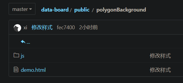
背景颜色可以通过Victor.js文件下的Victor方法里的diffuse值调节。
结语
感觉可视化项目难度不大(当然这只是对于我这种只会用轮子的懒人加缝合怪来说),无非就是熟练利用echarts配置,但麻烦的是效果需要自己仔细调节。